How to design a website that won't annoy away your customers
If your website frustrates people, they leave.
Most customers do not complain. They just close the tab and move on to someone else.
Good web design is not about making every section flashy. It is about reducing effort for real people trying to complete real tasks.
Practical examples: social media and news sites
Below are two common patterns your customers see every day. The lesson is simple: control and clarity increase engagement, while interruption and confusion kill it.
Social media example
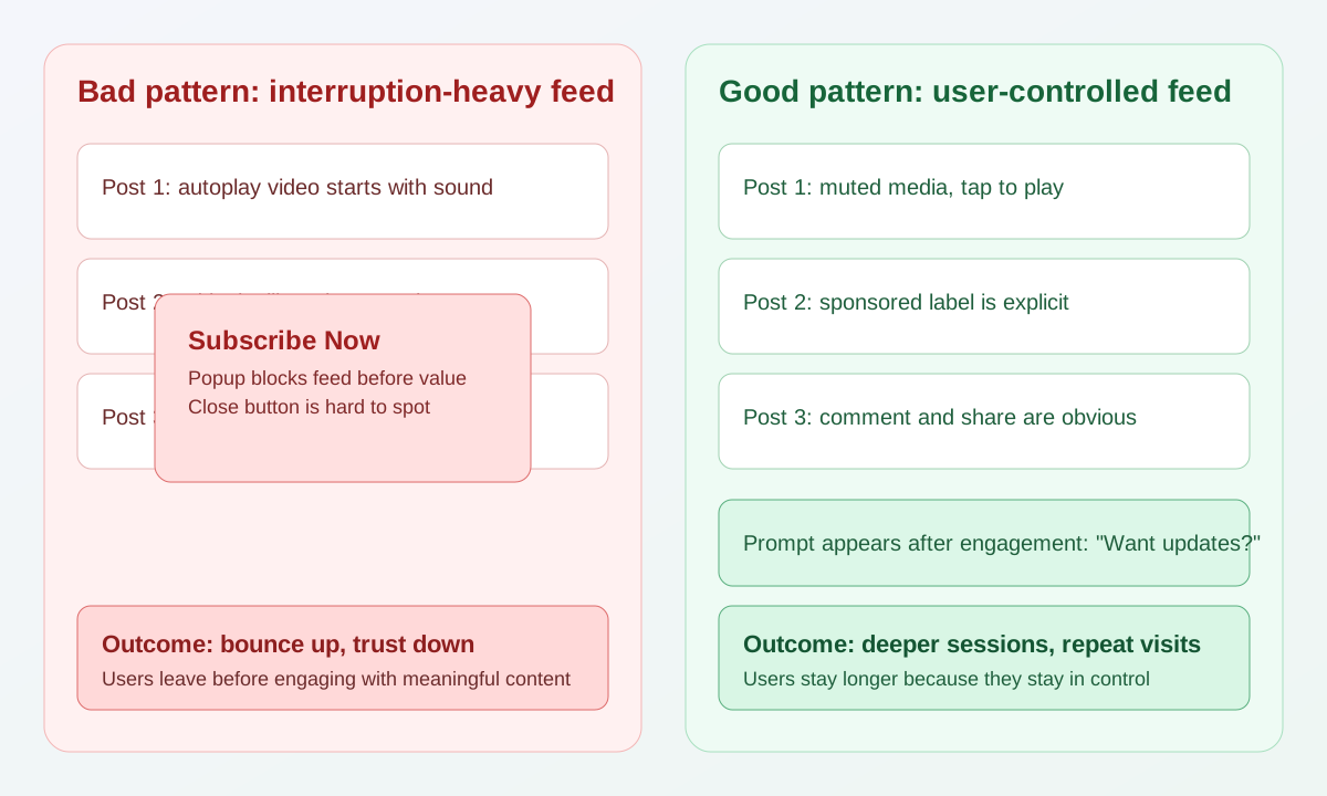
Bad engagement pattern:
- Feed starts with autoplay media and sound.
- A full-screen signup popup appears before users get value.
- Sponsored content looks identical to normal posts.
- Primary actions like comment and share are crowded by ad blocks.
Good engagement pattern:
- Media starts muted and waits for user intent.
- Signup prompts appear after a user has viewed a few posts.
- Sponsored posts are clearly labeled.
- Main actions are consistent and easy to tap.
Why this improves engagement:
- Users feel in control.
- They trust what they are looking at.
- They continue scrolling because nothing feels like a trap.
News site example
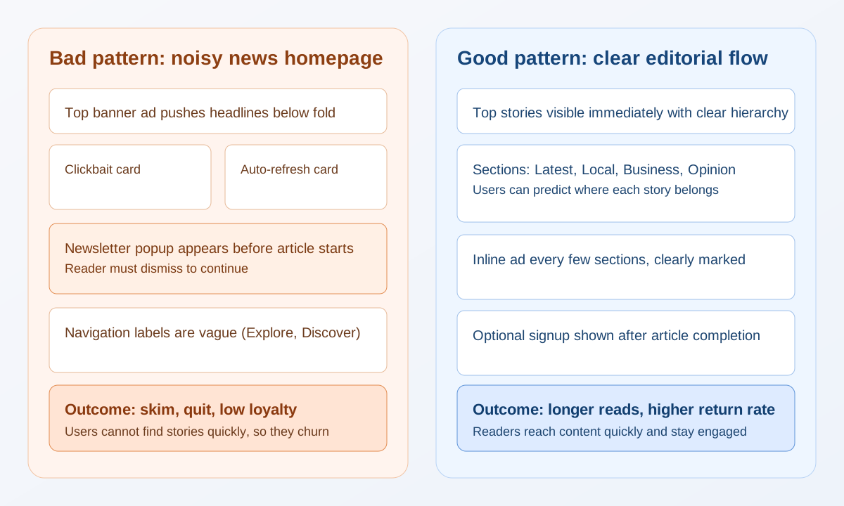
Bad engagement pattern:
- The first screen is mostly ad units, not headlines.
- A popup blocks the article before the reader starts.
- Navigation labels are vague, so users cannot predict where stories live.
- Layout shifts while the page loads.
Good engagement pattern:
- Top stories are visible immediately.
- Categories are explicit: Latest, Local, Business, Opinion.
- Ads are spaced out and clearly marked.
- Optional signup prompts appear near the end of the article.
Why this improves engagement:
- Readers can find relevant stories quickly.
- More sessions turn into full-article reads.
- Return visits increase because the experience feels reliable.
A practical engagement blueprint you can apply this week
Use this checklist on one key page and measure the difference:
- Define one primary action for the page.
- Remove or delay any popup before first meaningful interaction.
- Reserve space for ads so content does not jump.
- Make navigation labels specific, not clever.
- Run a mobile test: can a new visitor complete the main action in under 30 seconds?
Track three numbers for two weeks:
- Bounce rate
- Average engaged time
- Completion rate for your main action (contact, signup, purchase)
If engagement drops after an experiment, keep the old flow and test something smaller.
Start with UX that reduces effort
A good user experience feels obvious. People should not need to think hard to use your site.
Focus on the basics first:
- Keep your page structure clear, with one primary goal per page.
- Use simple headings that tell users exactly what they are about to see.
- Keep buttons and links consistent across the site.
- Make text readable with strong contrast, comfortable line-height, and enough spacing.
- Ensure pages load quickly on mobile, not only desktop.
If users are unsure where to click, your design is asking them to work too hard.
Run ads without harming trust
Ads can be part of a business model, but intrusive ad behavior destroys trust quickly.
If you run ads, follow these rules:
- Reserve ad space early so content does not jump while loading.
- Avoid auto-playing video or audio.
- Keep ad density moderate so content stays the main focus.
- Make sponsored content clearly labeled.
- Never place ad blocks where users are likely to misclick core actions.
Revenue matters, but long-term trust matters more.
Skip aggressive popups
Most popup strategies are optimized for short-term email captures, not long-term customer experience.
But if a customer's only viewing your site for the first time from Google, and they don't even get a chance to view your content before they're asked to subscribe, they won't engage.
They'll either:
- Dismiss the popup
- Sign up, but ignore your emails
- Worst case scenario, leave your site
What to avoid:
- Immediate full-screen popups right after page load.
- Multiple popups stacked in one session.
- Popups that hide navigation or core content.
- Hard-to-close overlays (especially on mobile).
What to do instead:
- Trigger optional prompts after clear user intent.
- Ask once per session, not repeatedly.
- Keep close buttons obvious and accessible.
- Test whether the popup improves outcomes or just interrupts people.
If your conversion tactic annoys users, it is not a real optimization.
Make things easy to find
A lot of website frustration is simply "I cannot find what I need."
Improve findability with:
- Predictable navigation labels (no vague menu names).
- A clear path to pricing, contact, and key service pages.
- Scannable content with short sections and descriptive subheadings.
- Internal links between related pages to help users move naturally.
- Search functionality on larger content-heavy sites.
People should reach the right page in as few clicks as possible.
Quick friction checklist
Before publishing, ask:
- Can a first-time visitor understand this page in 10 seconds?
- Is the main action obvious without scrolling too much?
- Does anything move unexpectedly while loading?
- Are there any interruptions before users can read the content?
- Can mobile users complete the primary task comfortably?
If any answer is no, fix that before adding anything else.
Final thought
The best websites feel calm, clear, and useful.
When you prioritize usability over gimmicks, customers stay longer, trust your brand more, and are more likely to convert.
If you want help improving your website UX without annoying your customers, reach out through my contact page.