Redesigning Studio Zanetti

The meet
I met Michael from Studio Zanetti at my best friends' wedding in June 2025. We exchanged contact information, and kept in touch following the wedding. When I viewed his website https://studiozanetti.com.au/ later in 2025, I offered to redesign it for him, as I noticed a number of design issues. He said yes.
This project brought together the same planning, design, WordPress, performance, accessibility, and search foundations covered in my website development services.
Identifying the requirements
Over the first few months of 2026, I worked with him to understand the issues that he faced with his website. He was very conscious of how SEO worked, as well as emerging trends in how people are increasingly using AI tools such as ChatGPT to find vendors. He wanted a website that would:
- Look great on both desktop and mobile
- Rank highly in AI and Google
- Load quickly
- Facilitate his discovery by new wedding and corporate clients
- Make it easy for clients to make bookings with him
- Not be bogged down by unnecessary fluff that drives clients away, such as chatbots or newspaper popups
- Integrate cleanly into WordPress, which was a system he had been using for years and was already familiar with
Planning the architecture
I had recently been experimenting with React Router for both Budgeto and this very site, and was well aware of its powerful capabilities when it came to server-side rendering. Given my own experience with React and how quickly sites can be built with it, I began designing a system where React Router would server-side render pages from a headless WordPress CMS. This would give us the powerful tools WordPress has for handling pages, blog posts and media, and minimise time it took both to copy content over and for Michael to get used to using the new site. It also gave me the ability to build flexible React components, injected via ACF Blocks into a WordPress plugin that I developed with the assistance of AI.
Identifying the components
Over several weeks, I spent time analysing each page on his website and coming up with a list of various different components he would need. Easy ones included:
- Hero block
- Image components
- Rich Text components
- Image and Text components
- Buttons
These are basic components used across many different pages, where not much complex business logic is required. I designed multiple different themes so that he could customise blocks as he needed.
Some of the more challenging ones which required lots of back-and-forth included:
- Gallery components
- Pricing packages
- Contact forms
- Subsite componentry
The Galleries
As a professional photographer, the Galleries are front-and-centre on Michael's website. He has over 15 galleries in use across his websites, previously powered by Flo Galleries. I developed a gallery component that could
- Easily import images from his old website into his new one, saving over a full day's worth of manual reuploading
- Flex between mobile and desktop, so image quality was not compromised on mobile
- Neatly align images of different sizes using a Round-Robin algorithm, a skill I picked up in one of my early Computer Science courses
- Beautifully render images with accessible and tabbable Previous, Next and Close buttons, correct alt tags, and swipeability on mobile Careful thought and design ensured an accessible, easy-to-use component that integrated seamlessly into the new website while accommodating the look, feel and raw images of the old website without significant extra effort.
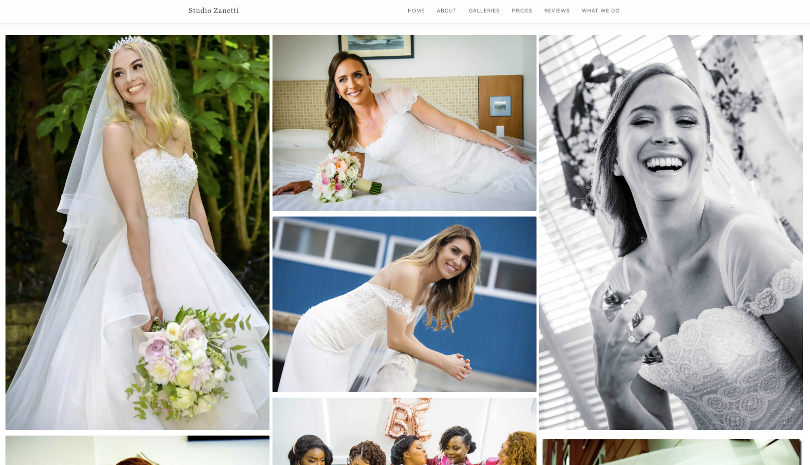 The most important part of a photographer's website? Photos!
Pricing Packages
For his pricing packages, I saw that all the price pages across his website had completely different setups. There was no consistent theming, it was an assemblage of text and image blocks combined with a Contact Us button that linked to a form on Michael's CRM (more on that later). I had the big challenge of creating a brand-new component based on a mish-mash of flexible blocks.
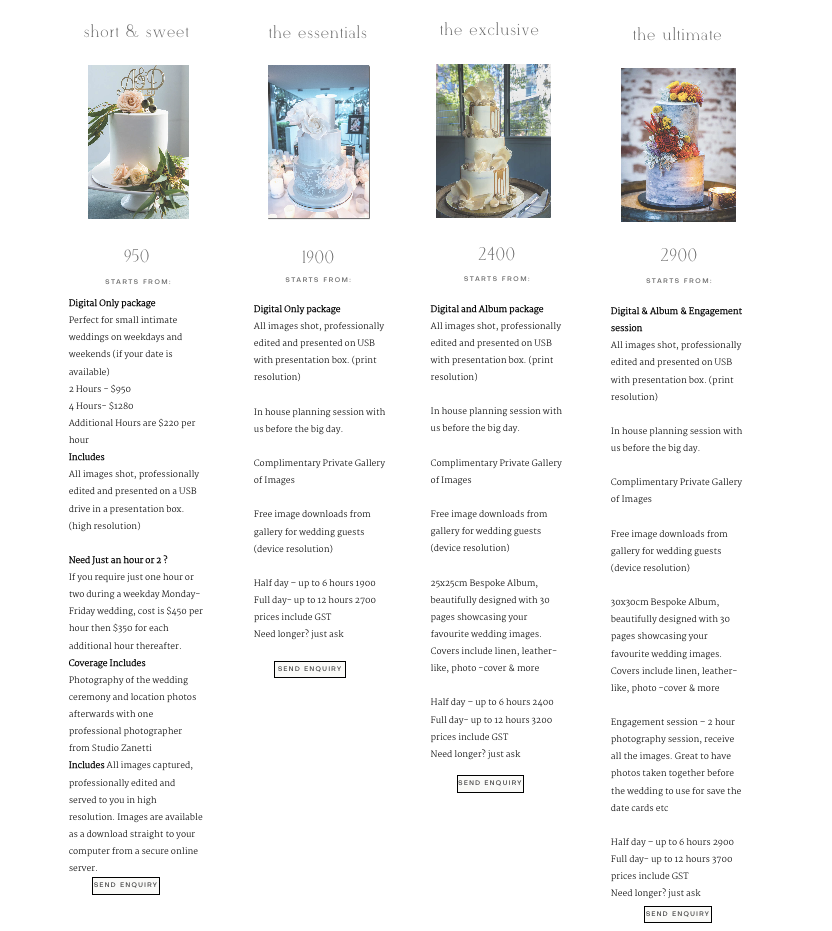 Michael's old pricing packages component. Note how the CTAs do not align, making the experience feel inconsistent and hap-hazard.
I created Michael a flexible Pricing Packages component which included:
- A title section
- A price label
- An images section
- An inclusions section
- A CTA, where he could link to an external site or reference on the same site or page
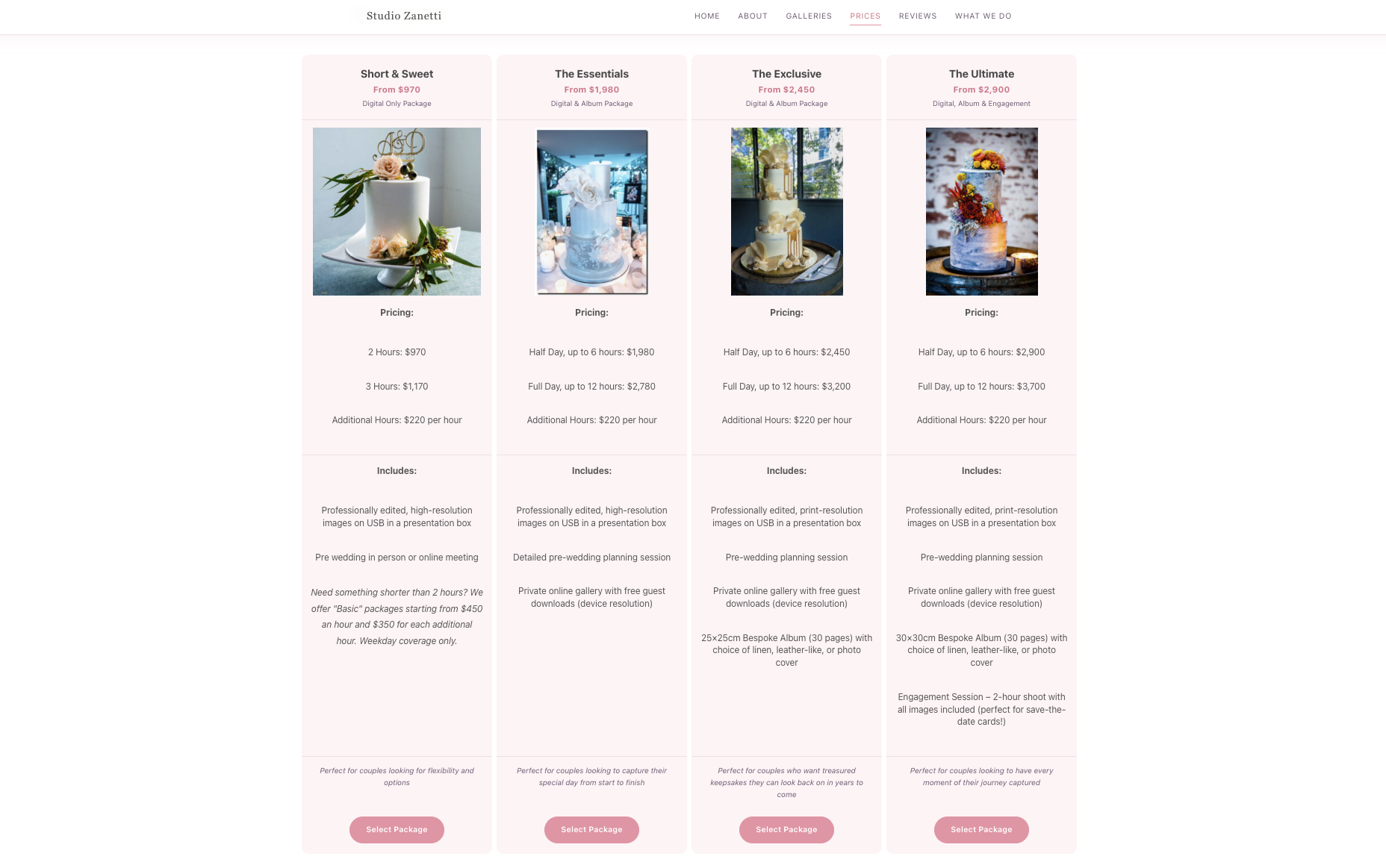 Michael's new pricing package, with a consistent look-and-feel
We also had the issue of how to make it work when there were multiple packages on a small screen. His old site had anywhere between 2-5 packages on the same page.
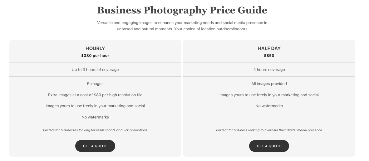 A more lightweight pricing package with only 2 options
I created a responsive component that collapsed into an accordion on mobile views, showing the title and price; and on desktop it would show them side-by-side. Stacking items vertically does not work well on mobile for long objects, and carousels can be a confusing experience for users if not done correctly, so we went with the accordion view to balance the best of both worlds.
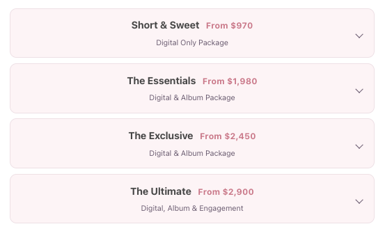 The pricing packages on mobile
Contact Forms
Michael's previous approach to funneling leads involved buttons that would redirect the client to a form hosted on his CRM. This was an opportunity to lose potential clients. The forms were also often out of sync with changes to his website - there was no single place to update everything.
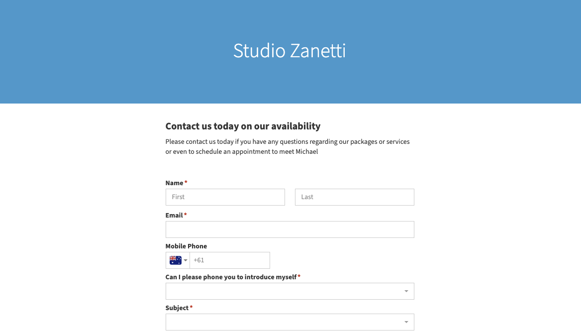 The old forms, hosted on Michael's CRM
The new approach involves a flexible form where he can add any fields that he chooses, and he will receive both an email with the details of what the client submitted as well as a new entry into his CRM, making sure that nothing gets lost. Pricing package CTAs can now also directly link into the form, scrolling to the form and pre-select the correct package for the user, so there is less friction. Users can also choose to receive a copy of the form to their email, so they can remember what they wrote.
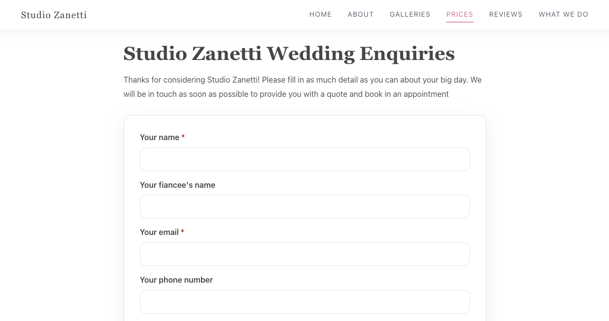 The new Forms component, smoothly integrated with the pricing page
All of this particularly helps with both conversion and user experience, because the fewer steps a client needs to take to submit a request, the less chance there is they'll get frustrated or bored and navigate away. Not to mention, the new forms are much better looking!
Subsites
One of Michael's major requirements was to be able to customise pages so that they would have dedicated menus, depending on which audience the page was trying to serve. He had the main site, which was dedicated to weddings and is what you land on when you navigate to https://studiozanetti.com.au/, and two "subsites", an LGBT+ wedding site and a Corporate and Events Photography site. These all had to have different header and footer menus, so that clients can comfortably navigate between pages in a different subsite without breaking the user experience by seeing the wrong menu.
 Michael's primary navigation menu
 Michael's LGBT+ weddings menu
 Michael's Corporate and Events Photography menu
One of the key things I challenged him on, given that my focus as a product engineer is delivering excellent user experiences, was
- How does someone who's landed on your home page find what they're really after?
I challenged him on this because I noticed a critical aspect of intersite navigation was missing. If a user landed on his home page by typing in studiozanetti.com.au into their browser, or just Studio Zanetti from Google, they had no way of accessing his subsites. This is a breaking experience for referrals who may not have a knowledge of how his website works. His subsites had been designed to funnel traffic through specific search keywords, so if someone Googled "Corporate photographer Sydney", he would come up; but if someone already knew about him, they wouldn't be able to find that page.
We added to his primary navigation menu a "What We Do" section, which if clicked opens a page containing all the different services offered. If hovered on, a user could also select to go to the LGBT Weddings subsite, or the Corporate Photography subsite. This means that if a user now comes to https://studiozanetti.com.au/, they can find what they're after. Subsites still remain segmented because the assumption is that if a user is on a subsite, they're there on purpose - but they can always click "Studio Zanetti" in the top left corner to return to the home page.
Next steps
The site went live on the 8th of June 2026, after months of work focused on design, performance, and usability. But the job's not done yet! The new site gives fantastic business-critical capabilities to optimise for AI searchability using metadata, JSON schemas, and structured page data. Now that handover is completed, Michael and I will work together to make sure his fantastic new website is able to reach as many people as possible. A smooth handover process is included as part of all of my packages to make sure not only that your site works as expected, but that you're equipped with the necessary skills to maintain it for years to come.
A post-launch Lighthouse lab snapshot returned scores of 100 for performance, 93 for accessibility, and 100 for SEO. Lighthouse scores can vary by page, device, and test conditions, but the snapshot provides a useful check against the technical goals of the rebuild.
All content was copied directly from the old website to minimise handover time, but now that handover is completed Michael is taking the opportunity to update his content to reflect more recent amazing work he's done, such as various weddings, and photographing the ACAMS 2026 conference - which you can read all about on his Instagram @studiozanetti
Oh, and if you're in need of a photographer in Sydney, no matter what the occasion, feel free to contact Michael via his new website. You can't get better than Studio Zanetti. Beautiful, candid, and natural photograph - just the way it should be.
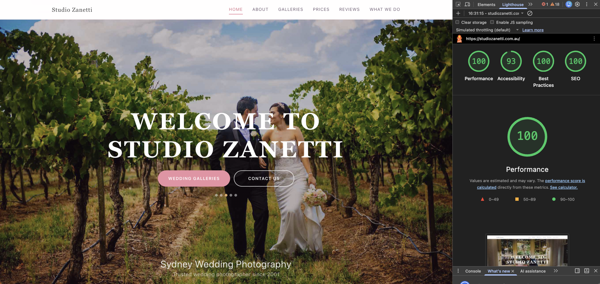 The end result of months of hard work. The results speak for themselves.
Feeling inspired?
Are you in a similar situation to Michael, looking for help with your website's design, performance, usability, and search foundations? Explore my website services, compare packages and starting prices, or tell me about your project. There is no obligation to proceed after the initial conversation.